library(palmerpenguins)
#> Warning: package 'palmerpenguins' was built under R version 4.6.1
#>
#> Attaching package: 'palmerpenguins'
#> The following objects are masked from 'package:datasets':
#>
#>     penguins, penguins_raw
library(ggplot2)17 Visualization
Try building a bar chart in base R, then a scatterplot, then a histogram. Each one calls a different function with different arguments, different parameter names, different assumptions about what your data looks like. You learn three APIs instead of one idea. ggplot2 takes the opposite approach: it gives you a grammar, a small vocabulary of composable pieces that describe any plot, and you assemble the pieces yourself. Once the grammar clicks, you stop asking “which function draws a heatmap?” and start asking “what mapping, what geometry, what coordinate system?”
This chapter assumes you have tidy data (Chapter 16), can reshape it with dplyr (Chapter 14), and can pipe it through transformations (Chapter 15). The data is clean. Now you see it.
17.1 The grammar of graphics
In 1999, Leland Wilkinson published The Grammar of Graphics, and the central argument was deceptively simple: a plot is not a type. Not a bar chart, not a scatterplot, not a heatmap. A plot is a mapping from data to visual properties, rendered by geometric objects, in a coordinate system; types are consequences of choices, not starting points.
Hadley Wickham turned this theory into software in 2005, building ggplot2 as a layered grammar where plots emerge from composing independent components:
- Data: a tidy data frame (Chapter 16).
- Aesthetics (
aes()): which variables map to which visual properties. - Geoms: what shapes represent the data.
- Stats: statistical transformations (often implicit).
- Scales: how data values translate to aesthetic values (colors, sizes, axes).
- Facets: small multiples, splitting by a variable.
- Themes: non-data visual styling.
Most plots need only three: data + aesthetics + geom. The rest are refinements you reach for when the defaults aren’t enough.
The simplest ggplot2 call needs three things: data, an aesthetic mapping, and a geom:
ggplot(penguins, aes(x = bill_length_mm, y = body_mass_g)) +
  geom_point()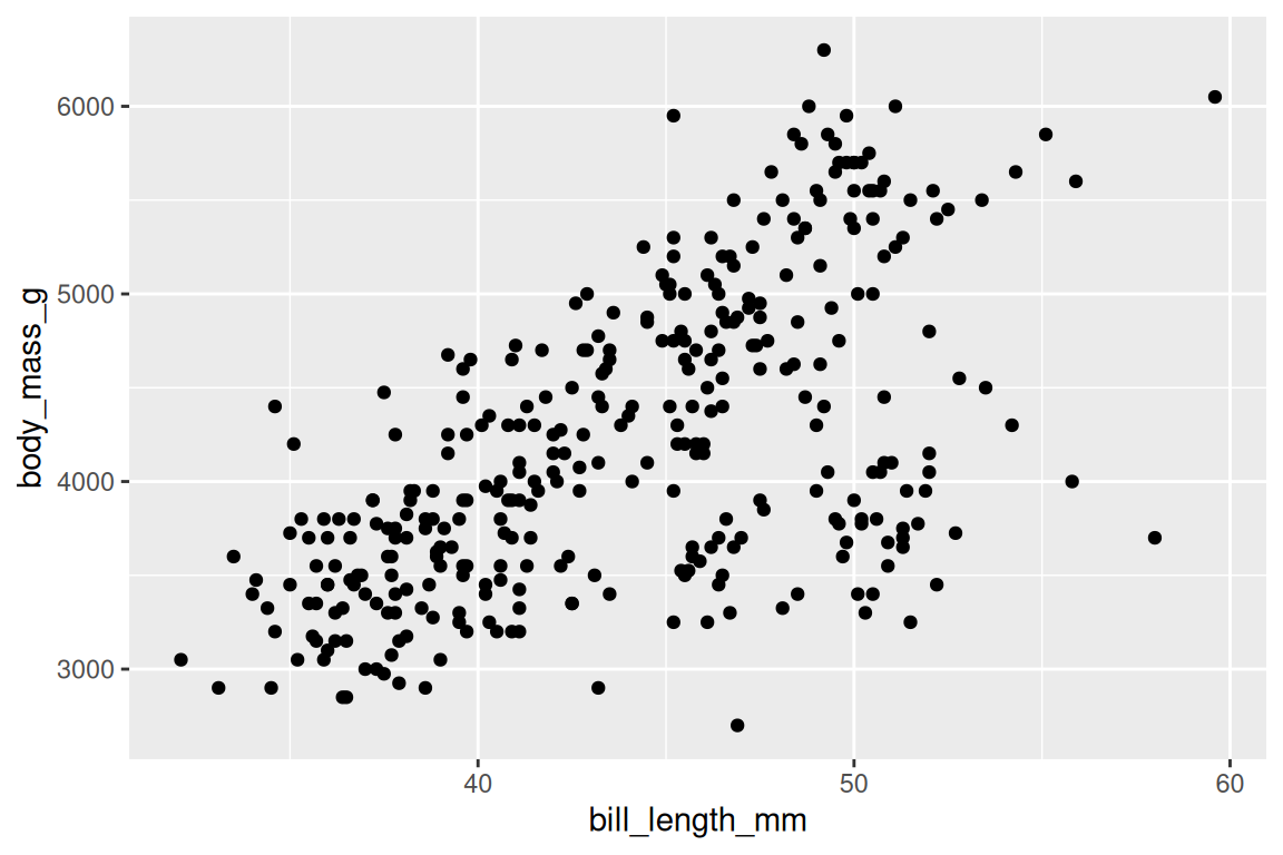
ggplot() sets up the coordinate system, aes() maps bill length to the x-axis and body mass to the y-axis, and geom_point() draws one point per row. The + adds the geom as a layer. Three lines, the entire grammar. But what happens when you want to encode a third variable?
17.2 Aesthetics: data to visuals
aes() creates a mapping from columns to visual properties:
ggplot(penguins, aes(x = bill_length_mm, y = body_mass_g, fill = species, shape = species)) +
  geom_point(stroke = 0.4, size = 2) +
  scale_fill_viridis_d() +
  scale_shape_manual(values = c(21, 22, 24))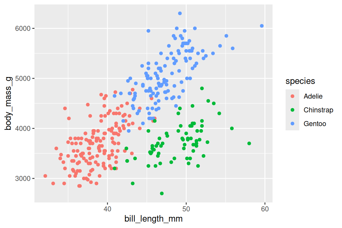
Writing color = species maps each species to a different color; ggplot2 picks the palette automatically and adds a legend. The mappings you will use most are x, y, and color (or fill); shape, size, alpha, linetype, and group are there when you need them.
NoteBertin’s visual variables
The intellectual roots stretch back to Jacques Bertin’s Semiologie Graphique (1967), which classified visual variables (position, size, shape, value, color, orientation, texture) and ranked their effectiveness for different data types. Wilkinson built on Bertin’s foundation, and when ggplot2 maps a variable to color vs size vs shape, it is implementing Bertin’s taxonomy: position is most effective for quantitative data, color for categorical.
There is one distinction that trips up everyone, usually within the first hour. Inside aes() means mapped to a variable. Outside aes() means fixed for all observations.
# Color varies by species
ggplot(penguins, aes(x = bill_length_mm, y = body_mass_g)) +
  geom_point(aes(fill = species, shape = species), stroke = 0.4, size = 2) +
  scale_fill_viridis_d() +
  scale_shape_manual(values = c(21, 22, 24))
# All points are steel blue
ggplot(penguins, aes(x = bill_length_mm, y = body_mass_g)) +
  geom_point(fill = "steelblue", shape = 21, stroke = 0.4, size = 2)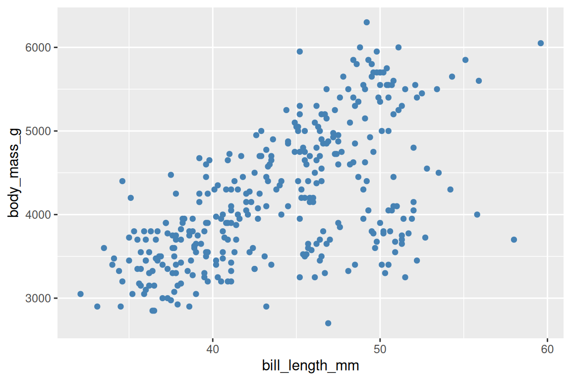
TipOpinion
If someone’s plot has a legend they didn’t ask for, they probably put a variable outside aes(). If all their points turned the same color when they shouldn’t have, they put a constant inside aes(). Getting this one distinction right fixes roughly half of all ggplot2 questions on Stack Overflow.
Aesthetics placed in ggplot() are inherited by every layer; aesthetics placed in a specific geom_*() apply only to that layer. This inheritance keeps your code DRY, but it also means a misplaced aesthetic can quietly propagate to layers you didn’t intend. So what shapes can those layers draw?
Exercises
- Create a scatterplot of
flipper_length_mmvsbody_mass_gfrompenguins. Mapspeciesto color. - What happens if you put
color = "blue"insideaes()? Try it and explain the result. - Map
islandto theshapeaesthetic in a scatterplot. What does the legend show?
17.3 Geoms: shapes for data
Each geom renders data differently. Same aesthetics, different geom, different plot. The question is which geom fits the question you are asking. A rough guide:
| Question | Geom | Data shape |
|---|---|---|
| How are two continuous variables related? | geom_point(), geom_smooth() |
x continuous, y continuous |
| How is one variable distributed? | geom_histogram(), geom_density() |
x continuous |
| How do distributions compare across groups? | geom_boxplot(), geom_violin() |
x categorical, y continuous |
| How does a quantity change over time? | geom_line() |
x ordered (time), y continuous |
| How do counts or totals compare across categories? | geom_bar() (counts rows), geom_col() (uses a y value) |
x categorical |
Start from the question, pick the geom, then refine. The rest of this section shows each one in turn.
geom_point() draws a scatterplot, the natural choice for two continuous variables:
ggplot(penguins, aes(x = flipper_length_mm, y = body_mass_g)) +
  geom_point()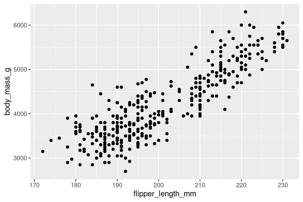
geom_histogram() shows the distribution of one continuous variable, and you control the resolution with bins or binwidth:
ggplot(penguins, aes(x = body_mass_g)) +
  geom_histogram(binwidth = 200, fill = "grey70", color = "white")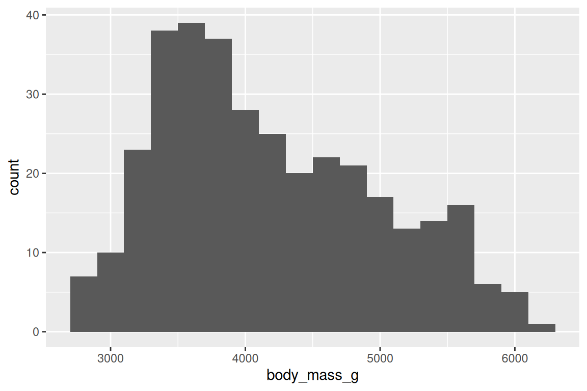
geom_boxplot() summarizes distributions by group (median, quartiles, outliers):
ggplot(penguins, aes(x = species, y = body_mass_g)) +
  geom_boxplot(fill = "grey85", color = "grey30")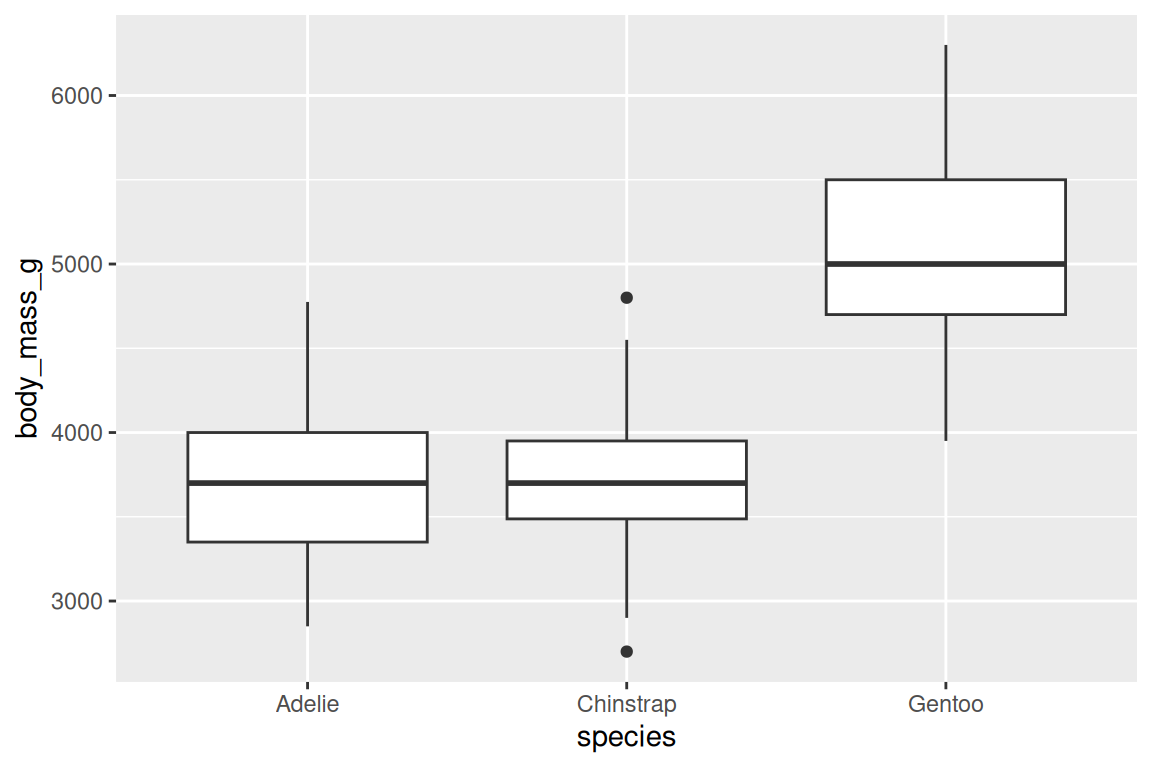
geom_density() is a smooth alternative to the histogram that estimates probability density, making it easier to overlay and compare distributions:
ggplot(penguins, aes(x = body_mass_g, fill = species, linetype = species)) +
  geom_density(alpha = 0.4) +
  scale_fill_viridis_d()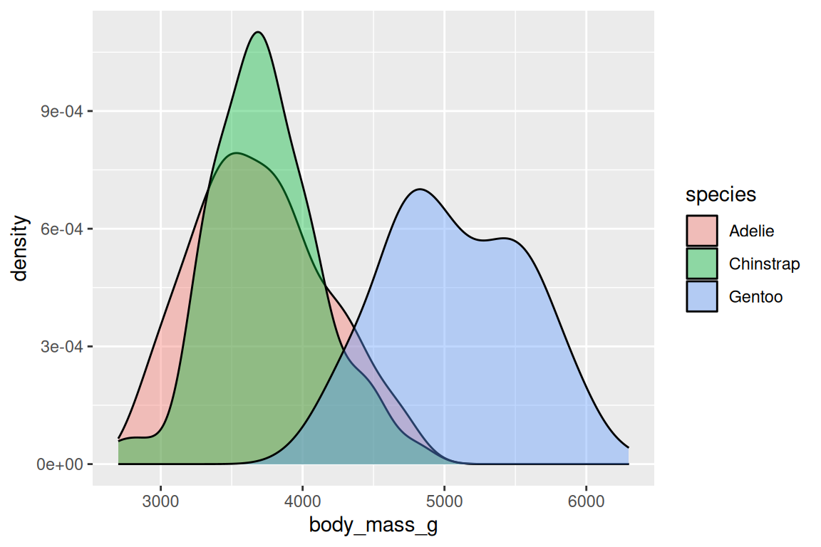
geom_line() connects points from left to right, the standard geom for time series and trends. Order matters: if the data isn’t sorted by x, the lines will zigzag into nonsense.
geom_col() draws bars with heights taken directly from the data, while geom_bar() counts rows for you. The difference is the stat: geom_bar() applies stat = "count" internally, so you only map x; geom_col() uses stat = "identity", so you map both x and y.
ggplot(penguins, aes(x = species)) +
  geom_bar(fill = "grey70", color = "white")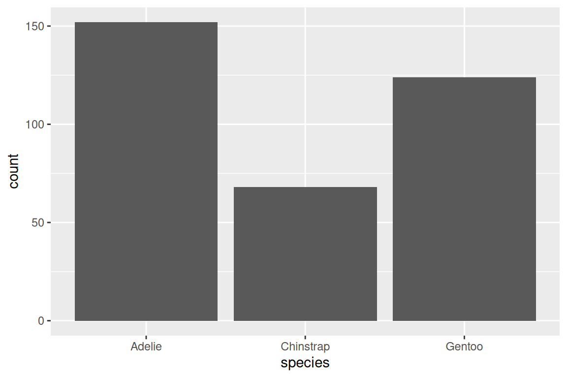
geom_smooth() adds a fitted line or curve, with method = "lm" for linear and method = "loess" for smooth:
ggplot(penguins, aes(x = bill_length_mm, y = body_mass_g)) +
  geom_point() +
  geom_smooth(method = "lm")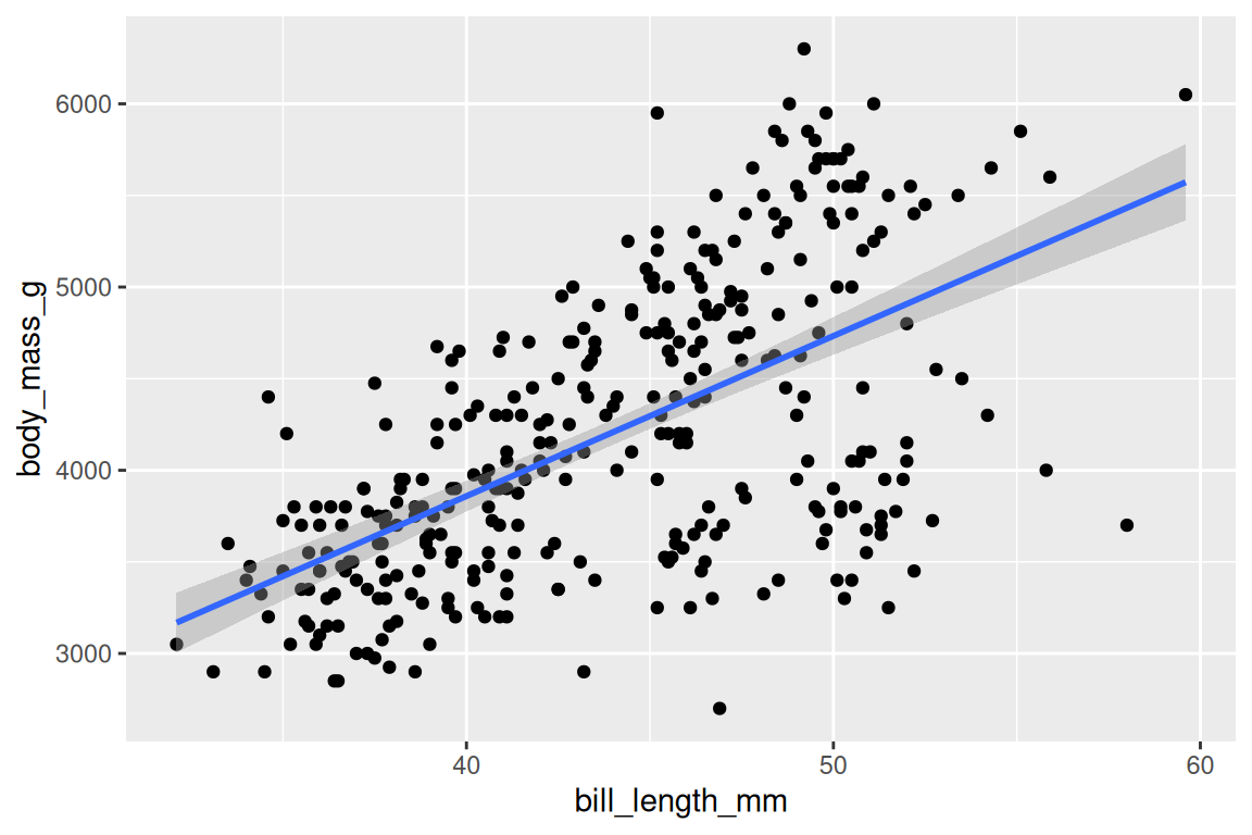
Layers compose with +. The plot above has two layers, points and a linear fit, and each + adds a component to the same plot object. But adding layers only changes the geometry. What about controlling how data values map to visual properties?
Exercises
- Create a scatterplot of
bill_length_mmvsbill_depth_mm. Add a smooth line withmethod = "loess". - Replace
geom_point()withgeom_density2d()in the same plot. What changes? - Make a boxplot of
flipper_length_mmbyisland. Addgeom_jitter(width = 0.2, alpha = 0.3)as a second layer.
17.4 Scales: controlling the mapping
Every aesthetic has a scale, whether you set one or not. Scales control how data values become visual values: which colors, which axis limits, which labels.
When you write aes(x = bill_length_mm), ggplot2 quietly creates a default scale_x_continuous() behind the scenes, and you only need to override it when the default behavior falls short: when you want to change axis limits, transform the axis, or pick specific colors.
Position scales control axes:
ggplot(penguins, aes(x = body_mass_g, y = flipper_length_mm)) +
  geom_point() +
  scale_x_continuous(labels = scales::comma)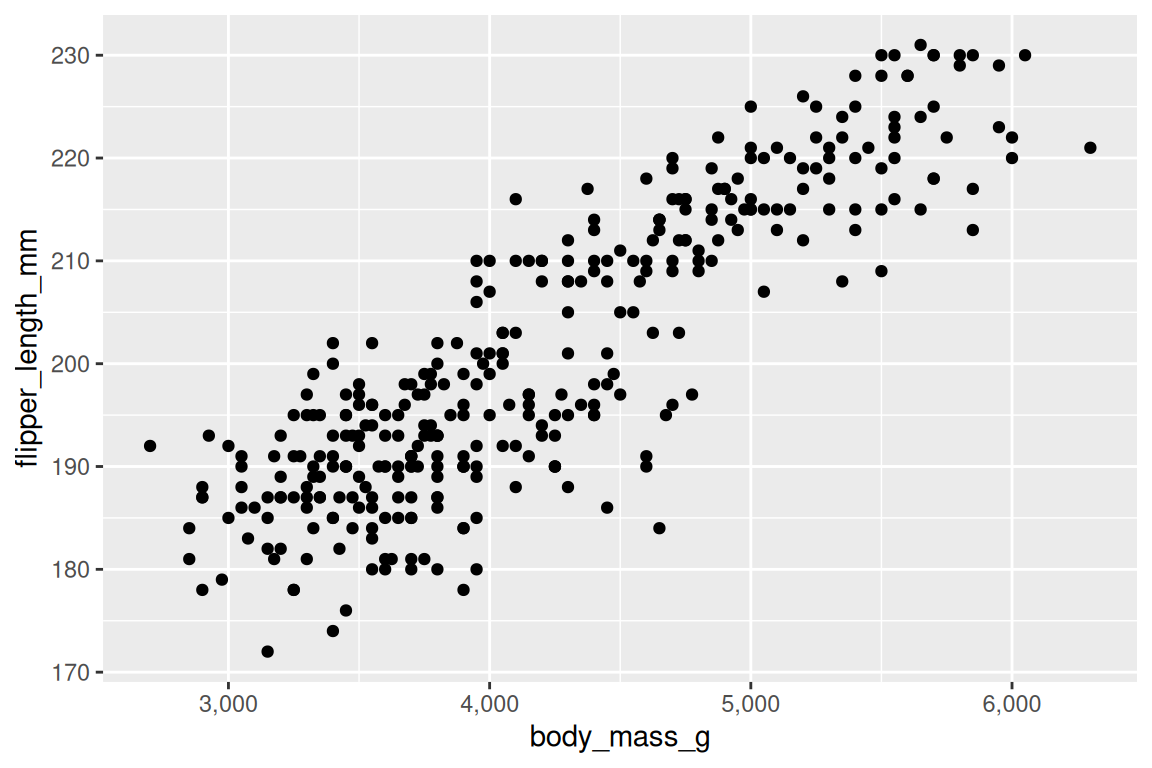
Color scales control how values map to colors. For discrete variables, the function scale_color_viridis_d() is a strong default — colorblind-friendly and perceptually uniform:
ggplot(penguins, aes(x = bill_length_mm, y = body_mass_g, fill = species, shape = species)) +
  geom_point(stroke = 0.4, size = 2) +
  scale_fill_viridis_d() +
  scale_shape_manual(values = c(21, 22, 24))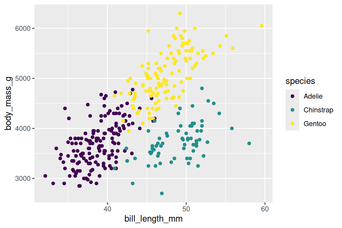
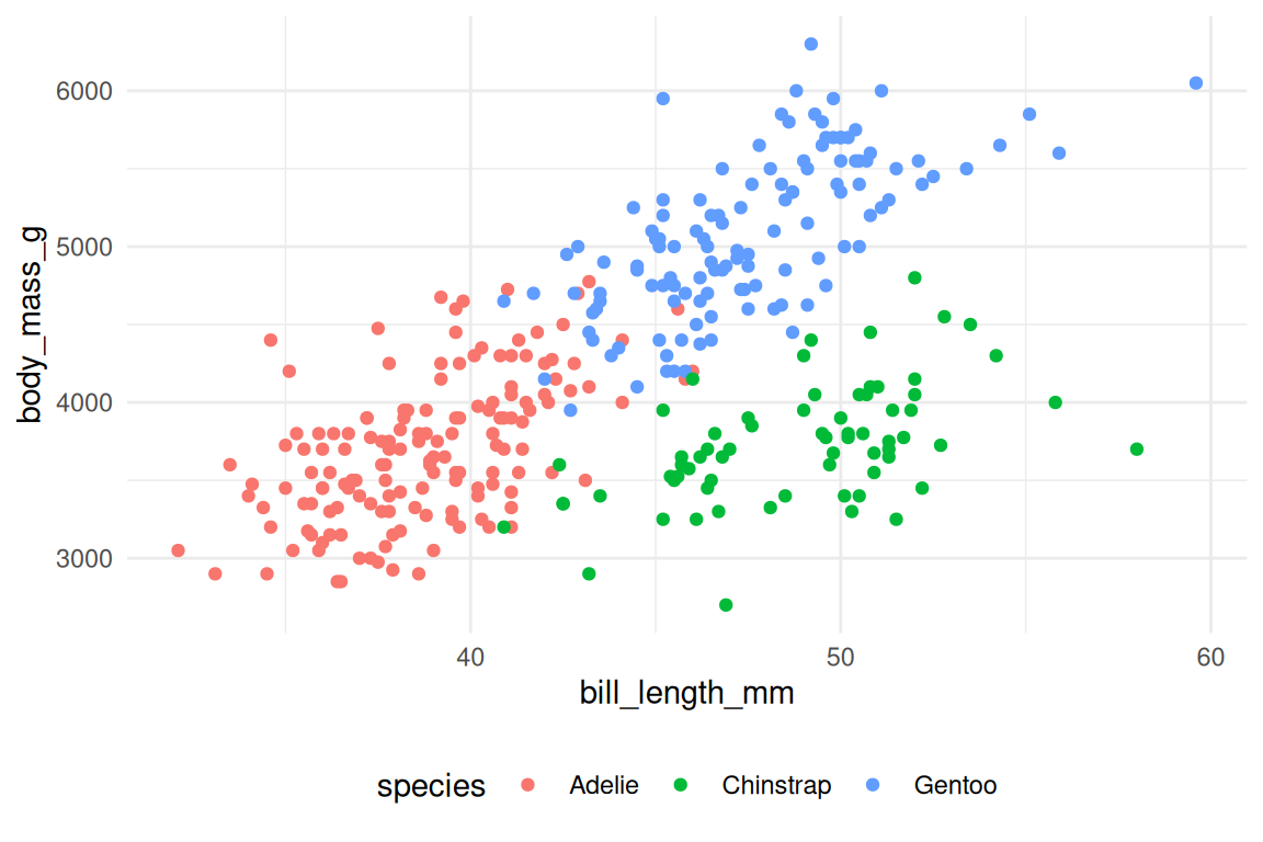
labs() controls titles and labels. Always label your axes with units, because bill_length_mm is a column name, not a label:
ggplot(penguins, aes(x = bill_length_mm, y = body_mass_g, fill = species, shape = species)) +
  geom_point(stroke = 0.4, size = 2) +
  scale_fill_viridis_d() +
  scale_shape_manual(values = c(21, 22, 24)) +
  labs(
    x = "Bill length (mm)",
    y = "Body mass (g)",
    fill = "Species",
    shape = "Species",
    title = "Palmer penguins"
  )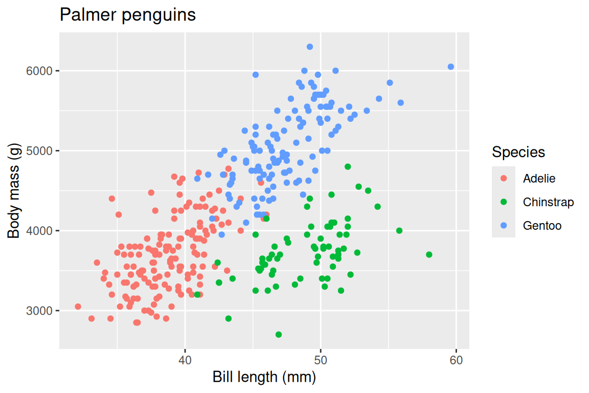
TipOpinion
Always label your axes with units. A plot with bill_length_mm on the axis is a working draft; a plot with “Bill length (mm)” is communication. The difference is thirty seconds of typing and the entirety of your audience’s comprehension.
Exercises
- Create a scatterplot of
bill_length_mmvsbody_mass_g, colored byspecies. Usescale_color_brewer(palette = "Set2")instead of viridis. - Add a
labs()call with a title, subtitle, and proper axis labels. - Use
scale_y_log10()on a plot ofbody_mass_g. When might a log scale be appropriate?
17.5 Facets: small multiples
Faceting splits one plot into multiple panels, one per level of a variable. facet_wrap() wraps panels into rows:
ggplot(penguins, aes(x = bill_length_mm, y = body_mass_g)) +
  geom_point() +
  facet_wrap(~ island)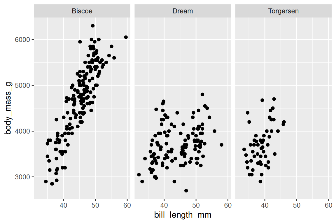
facet_grid() creates a grid with rows and columns:
ggplot(penguins |> dplyr::filter(!is.na(sex)),
       aes(x = bill_length_mm, y = body_mass_g)) +
  geom_point() +
  facet_grid(sex ~ island)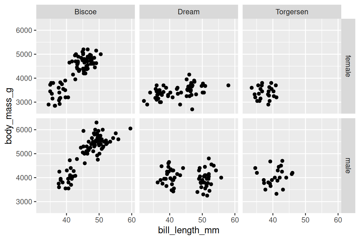
By default, all panels share the same axis scales. You can free them with scales = "free_y" or scales = "free", but use this cautiously: free scales make comparison across panels harder, which is the whole point of small multiples in the first place.
When should you facet instead of coloring? Facet when the groups would overlap too much for color to separate them, or when you want each group’s pattern to stand on its own without visual interference. Color works when groups are few, visually separable, and you want to see them in the same coordinate space.
Either way, faceting replaces the temptation to build the same plot three times with a loop or copy-paste. One facet_wrap() call produces all the panels, with shared axes for honest comparison, and the grammar handles the layout while you focus on the question. But what about the visual details that have nothing to do with data?
Exercises
- Facet the penguins scatterplot (bill length vs body mass) by
speciesusingfacet_wrap(). - Use
facet_grid(species ~ island)on the same plot. Which cells are empty, and why? - Add
scales = "free"to your faceted plot. What changes? Is the comparison easier or harder?
17.6 Themes: non-data styling
Themes control everything on a plot that isn’t data: background, grid lines, fonts, legend position. ggplot2 ships several built-in options:
ggplot(penguins, aes(x = bill_length_mm, y = body_mass_g, fill = species, shape = species)) +
  geom_point(stroke = 0.4, size = 2) +
  scale_fill_viridis_d() +
  scale_shape_manual(values = c(21, 22, 24)) +
  theme_minimal()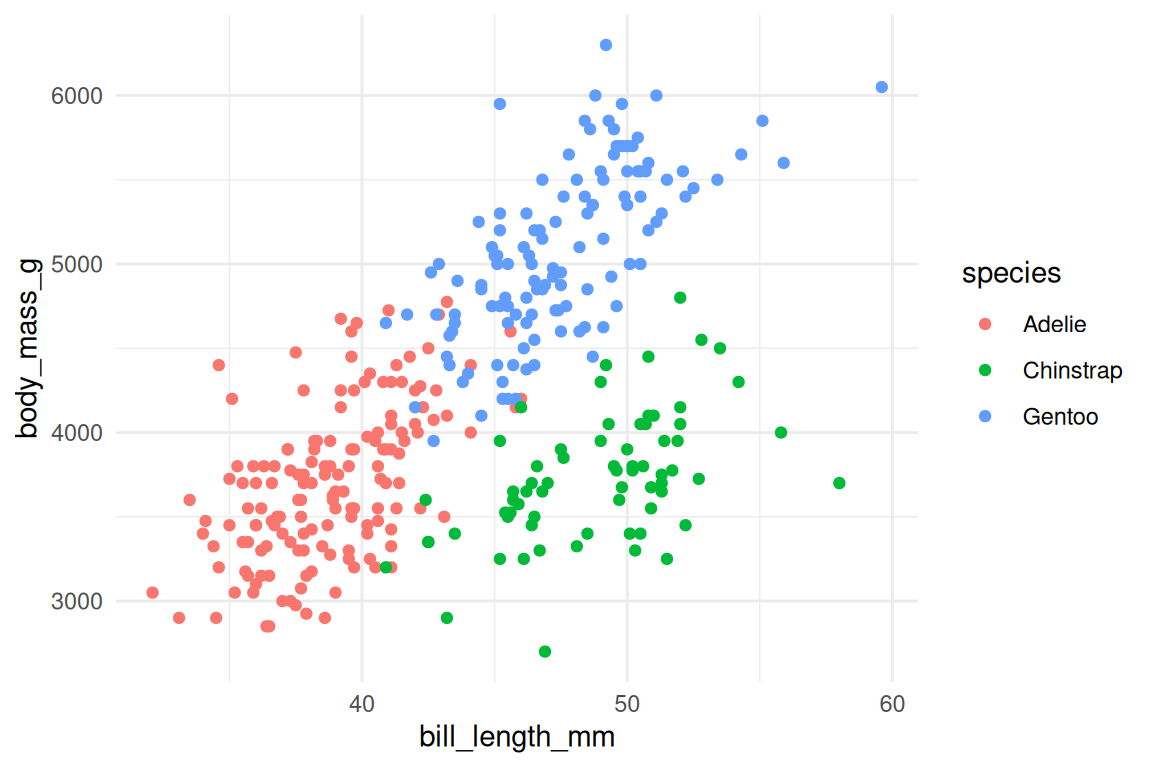
Other useful defaults include theme_classic() (white background, no grid) and theme_bw() (white background, light grid). For fine-grained control, theme() adjusts individual elements:
ggplot(penguins, aes(x = bill_length_mm, y = body_mass_g, fill = species, shape = species)) +
  geom_point(stroke = 0.4, size = 2) +
  scale_fill_viridis_d() +
  scale_shape_manual(values = c(21, 22, 24)) +
  theme_minimal() +
  theme(
    legend.position = "bottom",
    plot.title = element_text(face = "bold")
  )
To set a default theme for your entire session, use theme_set():
theme_set(theme_minimal())Themes are cosmetic. Spend your time on clear mappings and good labels before worrying about fonts.
That said, pick one default early (theme_minimal() or theme_bw() are the usual choices) and use it everywhere. Three plots in the same report should share a theme.
Exercises
- Apply
theme_classic()to any scatterplot from this chapter. How does it differ fromtheme_minimal()? - Use
theme(axis.text.x = element_text(angle = 45, hjust = 1))to rotate x-axis labels. When is this useful?
17.7 Putting it together
Read this example like a sentence: take penguins, remove missing sex, map bill length to x and mass to y and species to color, draw points, add linear fits, split by sex, use viridis colors, label everything, apply a minimal theme.
penguins |>
  dplyr::filter(!is.na(sex)) |>
  ggplot(aes(x = bill_length_mm, y = body_mass_g, color = species, fill = species, shape = species, linetype = species)) +
  geom_point(alpha = 0.6, stroke = 0.4, size = 2, color = "grey30") +
  geom_smooth(method = "lm", se = FALSE, linewidth = 0.8) +
  facet_wrap(~ sex) +
  scale_color_viridis_d() +
  scale_fill_viridis_d() +
  scale_shape_manual(values = c(21, 22, 24)) +
  labs(
    x = "Bill length (mm)",
    y = "Body mass (g)",
    color = "Species",
    fill = "Species",
    shape = "Species",
    linetype = "Species",
    title = "Bill length vs body mass by species and sex"
  ) +
  theme_minimal()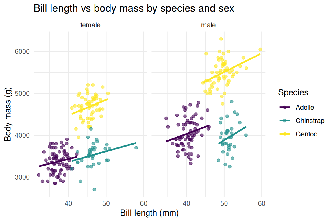
The pipe feeds data into ggplot(), and after that, + composes the layers. Each line adds one component, so you can read the full specification top to bottom, like a recipe where every ingredient appears in order.
The pattern for most visualizations follows the same shape:
- Start with the data.
- Pipe it through any needed transformations (filtering, summarizing).
- Hand it to
ggplot()with your aesthetic mappings. - Add geoms.
- Refine with scales, facets, labels, and a theme.
Each step is independent: swap geom_point() for geom_jitter() and nothing else in the specification changes. + is doing more work than it looks like.
17.8 ggplot2 as lambda calculus
A ggplot specification is a program. Not metaphorically: it is a tree of expressions that gets evaluated to produce output, just like any other R expression, and the connection to the ideas from Chapter 7 runs deep.
aes() is a function that returns unevaluated expressions. When you write aes(x = bill_length_mm, y = body_mass_g), R does not look up bill_length_mm in your environment; it captures the expression and stores it for later evaluation inside the data frame. This is the same quoting mechanism you will encounter in Chapter 26: aes() is non-standard evaluation applied to visualization. The mapping is a description of a computation, not the computation itself, exactly like a lambda expression describes a function without executing it.
The + operator on ggplot layers is monoidal composition. Each layer is an independent unit, combining two with + produces a new plot object, and the empty plot ggplot() acts as an identity element (adding it changes nothing). An associative binary operation with an identity element is a monoid, one of the simplest structures in algebra. String concatenation with "" as its identity is a monoid, and so are list concatenation and function composition. ggplot layers are another instance of the same pattern. We will see in Chapter 21 that Reduce() works precisely because it folds over a monoid, and in Section 30.8 how the pattern generalizes further.
When ggplot2 draws a plot, it runs a sequence of transformations: data, then stat (statistical transformation), then scale (map values to aesthetic space), then coord (project into pixel coordinates), then render (draw shapes). Each geom_*() specifies what the final rendering step should draw; everything before it is a data transformation pipeline.
This pipeline is itself function composition. Each step takes a data structure and returns a data structure, making it render ∘ coord ∘ scale ∘ stat, pure composition.
This is why the grammar works so well: a small set of composable functions rather than a grab bag of plot types. You have already seen this principle at work: small functions that compose are more powerful than large functions that don’t (Chapter 15). ggplot2 applies that principle to visualization.
Compare this to what came before. Base R’s plot(), barplot(), and hist() are self-contained functions, each with its own parameter names and its own assumptions about data shape. Adding a fitted line to a scatterplot means calling abline() after plot(), a second function that depends on the first having already drawn to the graphics device. There is no plot object to inspect or modify; the drawing has already happened. If you want a variant (a scatterplot with a smoothed trend, faceted by species, with a custom color scale), you are writing procedural drawing code. The grammar inverts that relationship. Each layer is an independent object, and combining two with + produces a new plot object you can store, modify, and pass around before anything touches the screen. The layers compose because they are values, not side effects, following the same principle that makes pipe chains and map() calls work. Graphics is where composition becomes visible, because you can see the result on the screen and trace each layer back to the line of code that produced it.
What happens when you apply this principle to your own domain?
Exercises
- Build a plot from scratch: filter
penguinsto only Adelie penguins, then create a scatterplot of flipper length vs body mass, colored by island. Add proper labels and a theme. - Create a faceted histogram of
body_mass_gbyspecies, withbinwidth = 100. Usefill = speciesand setalpha = 0.7. - Start from the full example above and modify it: change the geom to
geom_density2d(), remove the faceting, and switch totheme_classic(). What does the plot reveal?
17.9 Common mistakes
Putting aes() in the wrong place. A variable inside aes() creates a mapping; a value outside aes() sets a constant. If your legend looks unexpected, check which side of aes() your arguments are on (Section 17.2).
Using |> instead of + after ggplot(). The pipe feeds data into ggplot(), but after that first call, every addition uses +. This trips up every beginner exactly once. If you get an error like “could not find function geom_point”, you probably wrote |> where you needed +. The reason ggplot2 uses + rather than |> is partly historical (ggplot2 predates both magrittr and the native pipe by a decade) and partly conceptual: the pipe transforms data sequentially, while + accumulates structure, and these are different composition models (pipeline vs builder).
# Wrong
ggplot(penguins, aes(x = bill_length_mm, y = body_mass_g)) |>
  geom_point()

# Right
ggplot(penguins, aes(x = bill_length_mm, y = body_mass_g)) +
  geom_point()
Making multiple layers when the data needs reshaping. If you find yourself writing geom_line(aes(y = col_a)) and then geom_line(aes(y = col_b)) for different columns, that is a signal to use pivot_longer() first (Chapter 16) and map the new column to an aesthetic.
Complex calculations inside aes(). Move them to mutate() first (Chapter 14). Something like aes(x = log(value + 1) / max(value)) is hard to read and harder to debug; create the column, then map it.
Overloading a single plot. Too many colors, too many geoms, too much data crammed into one frame. If a plot is hard to read, split it into facets or separate plots. A simpler plot almost always communicates better.
Most ggplot2 errors aren’t really about syntax. They are about structure: the data is in the wrong shape, the mapping is in the wrong place, or the wrong composition operator connects the layers. When a plot doesn’t look right, check the data and the mappings before adjusting visual parameters, because the grammar tells you where the problem is if you listen to it.
Once the plot is right, you need to get it out of R.
17.10 Saving plots
A ggplot object is a deferred computation: it describes a plot but does not produce pixels until you print or save it. Printing sends the result to the screen; ggsave() sends it to a file:
ggsave("penguins_scatter.png", width = 8, height = 5, dpi = 300)The file format is inferred from the extension: .png, .pdf, .svg, .jpg. For publication, PDF or SVG gives you vector graphics that scale cleanly at any size. For slides and web, PNG at 300 DPI is standard.
You can also pass a stored plot object explicitly:
p <- ggplot(penguins, aes(x = bill_length_mm, y = body_mass_g, color = species)) +
  geom_point() +
  theme_minimal()

ggsave("penguins_scatter.pdf", plot = p, width = 8, height = 5)
The width and height arguments control the output dimensions in inches (the default unit), and getting these right matters more than any theme adjustment: a plot squeezed into half its natural width produces unreadable axis labels, while a plot stretched too wide scatters the data into a sparse, floating emptiness. Experiment with dimensions before finalizing. It’s the last step, but it determines whether anyone can actually read what you built.
TipOpinion
Always save with ggsave(), never with right-click or the RStudio export button. ggsave() is reproducible: the same code produces the same file tomorrow. The export button is a one-off action with no record of the dimensions or resolution you chose, and six months from now, when a reviewer asks you to regenerate Figure 3 at higher resolution, you will understand why that matters.